Leterme Dowling
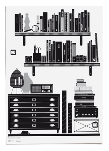
Leterme Dowling designed the very-slick-and-stark black and white brand identity and marketing materials for Counter-Print.co.uk. Gotta luv the tongue in cheek reference that mostly, books are printed on white page with black text. And smell terrific.
Sorry for having you break your neck reading – please indulge in the good care advice for books on the tote bag. Delicious read. And that from book lovers as us.


