Logo anatomy
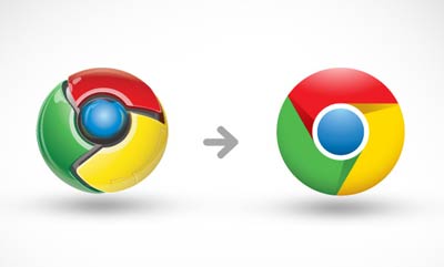
Google Chrome Identity. Simplifying an icon by Office.
Collaboration with the Google team to develop a simple identity that embodies the spirit of Chrome. To maintain the equities of the previous mark, the logo is based on the same interlocking forms and colors. It was stripped down from the highly stylized, Web 2.0, glossy 3-D icon to reflect Chrome’s super-simple, fast experience in a way that’s refreshingly light and modern.
Wow never realized how ‘busy’ the 1st one looked.


