M(F&)T
As shown in their logo, MacFadden & Thorpe dig bright contrasting colors and their work is essentially that. Bright – as in smart; contrasting – as in their assignments; colourful as in their typographic penchant.

_______
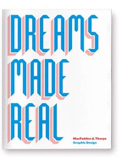
Loooove this. M&T Yearbook #1. A small book documenting their first year in business through the projects they worked on and the people and adventures they brought us.
(If you want a copy, drop them a line.)

_______
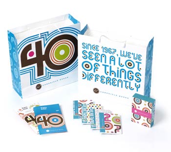
Chronicle Books Branding. Elements from annual graphic identity systems that played off the theme of seeing differently.


