Power slider
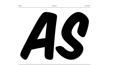
Now I don’t know if the font on Aurèle Sack index is Comic Sans which would be a pity wouldn’t and a first, at least for me, to actually give it props.. The sheer humongous size of the letters is well.. very-very-very big and make quite a first impression.
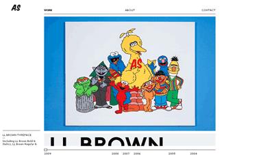
What I want to attract your attention to (click the work link) is the slider at the bottom that lets you cruise his portfolio per project per year, whereas you can quick glance and stop where you want.
Huh! That’s smart.


