Small don’t work
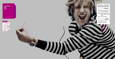
Promising overture for UP inc a branding studio, but don’t think the small rounds navigation serve them well to propel what they do in a favorable way. Especially smallish type – you need to mouse over each to find the ‘work’ section, which then shows small visuals.
Wonder why they did not use the same ‘flashy’ style as the intro?


