Channel [v]
For us the week-end starts shortly. The Drop Studio were commissioned to create 10 seconds spots on the topic of the Week-end Never Ends for Channel [v].
What they did – is spot-on.
Enjoy these – and your week-end!


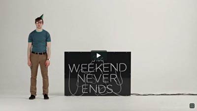


For us the week-end starts shortly. The Drop Studio were commissioned to create 10 seconds spots on the topic of the Week-end Never Ends for Channel [v].
What they did – is spot-on.
Enjoy these – and your week-end!
Time Space Everything by Marius Bauer
“Good design delivers one message”. That´s one of the key parameters for this projects. If you can deliver one message very clearly, your design is functional. Where art leaves interpretation and discusion. They wanted to bring those two disciplines together and I think you can see it quite well in Time Space Everything.
Wallpapers – t-shirts – book available via Systemkings.

Calling all UXers – the future is mobile – get it?
Mobile First by Luke Wroblewski
He knows more about mobile experience than the rest of us, and packs all he knows into this entertaining, to-the-point guidebook. Its data-driven strategies and battle tested techniques will make you a master of mobile—and improve your non-mobile design, too!

Here Design were invited to create the branding for Yotam Ottolenghi’s first restaurant – a departure from his highly successful eponymous eateries – in London’s West End.
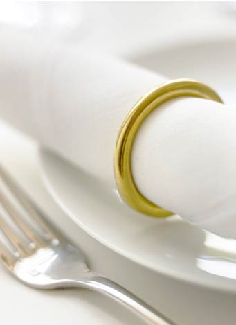
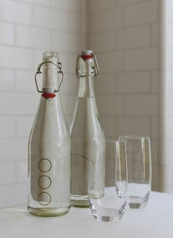
Exploiting the ‘O’ letter in NOPI – see how they have transposed the letter into everything that makes the brand: surfaces, objects, clothing, menu.. even the VC sign.
Outstanding concept!


Formed in the summer of 2010 by graphic designer Antonio Carusone, Vetted evolved from an overwhelming obsession and passion for well designed objects.
Found the Unit Portables Unit 01 shoulder bag.
Wanna more cool objects I found?

Exactly what I need today and Oh so appropriately describing how I near feel just now.. So much on my plate and feeling the pressure. Don’t Panic! Good advice.

_______
Wallpaper by Ben Stevens aka Super Nova Interstellar Design

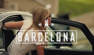
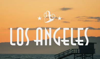
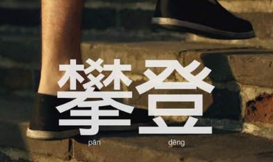
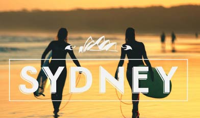
Live the Language par EF are superbs live action plus typography laced spots. Founded in 1965, EF is now the world’s largest private educational company, with a group of 16 subsidiaries and non-profit organizations centered around language learning, educational travel, cultural exchange, and academic programs.
Travel the world! Watch them all.

________
________

________

________
________
________
________
via: Ozon3
This morning I am stricken and saddened. Just read the news that Arnaud Mercier aka Elixir Studio (about 12-13 yrs ago) has passed. Founding partner of Area17 (also refers to the optical cortex of the brain where visual data is received, patterns are recognized and images are formulated. This is not a coincidence) have issued this message.
_______
Addendum: Area17 released a short summary of what happened.
_______
He was a pioneer, visionary and his talent will be greatly missed in the design community. Through the years always supported his career and efforts. What a loss. I am so sad.
Follows a little homage to a great designer.
_______
Meet Arnaud Mercier, art direction and embark on a voyage into a breath taking sweeping view of a one of a kind portfolio.
At Elixir Studio you discover his unique style, his jaw dropping pictures and flash storyboards that which makes Arnaud an accomplished master communication designer.

Best of the Year (BOTY) recipient in 2002.

_______
From the *subway* experiment to interface designs for Blastradius studio and reknown clients, each work is different and extensive. Such profound thought is given to visual placement for navigation and text as well as branding integration… one very well should spend lots of time, learning from him.

Don’t miss his ‘Journey on flash movie’ and watch how the frames unfold. I must have watched it about x4 times!
But there is more! Be it picture montages, print design, logotypes or design stills, there is not one single entry that is boring.
Another of his quality is understanding chromatics. The play of color, the contrast, these little bits of numbers and arrows, though a style that is much in used… sorry but not with this kind of subtlety!
I bet even his discarded work would be worth seeing.
Now, can somebody book this guy to publish his own work? Wish I could ’cause I would.
_______
circa: 1999-2000
_______
Arnaud Mercier is now operating under AREA17.


circa: February 2002
_______
Where do great talent go? At AREA17, home of extra prolific creative execution master Arnaud Mercier (who was listed as a design forte recipient back in 2002) et al.
Luckily for us, most of his outstanding past work is still available for viewing.
Now what do you think of the information tree-like navigation?
Again, LUV his work!


circa: December 2006
_______
AREA17 located in both Paris and New York, founded by Arnaud Mercier have a new website.. Anyhow, they have a tagline that pretty much summarize their approach:
We believe websites can change people’s lives.. is that crazy?


circa: March 2010
_______
He is also the founder of these 3 services which highlight his personality, temparement and interests. He was aiming at facilitating human interactions in art, career and commerce.
 Subfolio – customizable web interface to your file system
_______
 Krrb – connect with your neighbors in-person commerce
_______
 Slash – a mobile / online contemporary art agenda
_______
Sooo grateful to have found a repository of large graphics of his early work. There are much more – follow link below to see.


_______
via: Graphic ExchanGE
If you’re on Google+ I have shared my ‘Designistic’ circle with you for design / creativity / inspiration news.
_______
_______
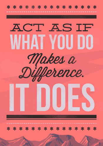
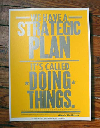
Quote: Act as if what you do makes a difference. It does – William James
via: Poster designed by Jonny Delap.
Cumulus and Foam is the most beautifully grotesque font of our time. The value of a dischordant note, garish palette, misshapen form? Cumulus & Foam is a specimen for such investigation. In Stefan Kjartansson’s newly-minted font, the characters spawn awkward spaces and strange intersections.
Whole lot more fonts: YouWorkForThem.


Stereohype announced this year’s button badge design competition winners (and runners-up) of their 7th annual competition.
The Intergalactic Social Network Wars by Jayga Rayn
The battleground is the way most of us communicate every day: social media. Facebook has become gargantuan after usurping Myspace, but Twitter has grown rapidly with its celebrity endorsement and Google+ has finally given Google a real foothold in the market after many failed attempts.
Last week, Mark Zuckerberg got on stage for Facebook’s yearly F8 developers conference and proceeded to drop technological bombs like he was a rapper announcing a new mixtape or a certain hair line challenged basketball player announcing his free agency intentions.
_______
View the Timeline demo.

_______
Invitation for a party to celebrate the publication of:
Brand Thinking and Other Noble Pursuits by Debbie Millman.
Location: SVA Masters in Branding Studio
132 West 21st Street – 11th FLoor – New York
RSVP: lisa.g@sterlingbrands.com
Upcoming: October 27 – 7-9 pm

Sport Review logo and covers by Astronaut design. One of the best logo I’ve seen this year. Smart the superimposed S / R whereas the R becomes a decorative element, grounds the upper fold and pushes the eye to read below.


Fantastic packaging and branding solutions for Altia by F33Grupo! I hold dear using black on white for a clean, minimalist modern feel. Less is more in the sense that all the negative space gives added perceived value to objects.
And what about the iconographic that are like two hands holding it. Brilliant. Luv the double sided poster with outlined products.
Good design!


Remember the co-creation article I shared? As a ‘why’ person – I am reaping insight in the white paper in ref w/ co-creation = sharing (insight, tips, direction, etc) in view of a project I’m working on.
Admission of ignorance here.. No one owns all knowledge – ain’t that why the net work = net worth w/ the right people around us to watch / tutor / correct? Here is an addendum passed on by Matt Legrand.
Design Thinking Is A Failed Experiment. So What’s Next? by Bruce Nussbaum.
_______
Major renovations and construction happening in and outside our building – noise level? You don’t want to know. Will be working off-site for the next 2 weeks.
_______
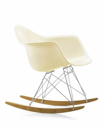
via: The Lollipop Shoppe one of my all times fav Eames design: the Rocking Chair
Save the words for another day. Or for meet-ups with clients. So they say – Intercity who love graphic design and art direction have used huge giga visuals to show off their portfolio. That’s it! And plenty.
And yes they have created the CR (Creative Review) logo and a lot of their covers. So words – are irrelevant. Their work speaks amply.
Don’t we wish clients would be just this way wowed?


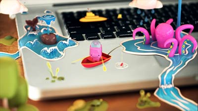
On a total different mode and mood! Luscious sweet animation for the Cartoon Network "New Cosmos" as imagined by director Nando Costa part of the Superfad collective. The scenery is a kaleidoscopic maelstrom of shiny surfaces eye-candy.
Don’t we all secretly wish the world behaved like it does in cartoons?
Sometimes yes.


_______
The characters are mimicking what appeals to us most: huggable little toys.
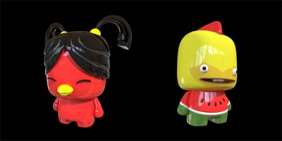
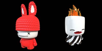
Pop culture has become the ‘way’ to show products. The motion graphics are stunning. Created by New Order. Guess? It’s for a line of luxury bags – made as a teaser.. for what?


_______
Because Studio relaunched a new website since first coverage. They’ve opted with a rotation of taglines and images to drive some of their key services upfront and a punchy yellow drop-down menu. Same quality of work! Same portfolio gooness.
Have a look at their previous one. Which do you prefer?


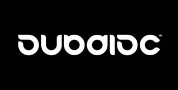
Some of Marcus Eriksson aka Subdisc extraordinary logo design smples. Brilliant the inverted ‘Y’ that becomes the ‘A’.

_______
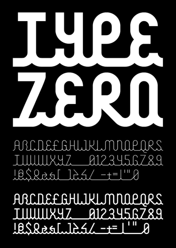
Addendum: Type Zero font
Must say that is the first time I fall on something like this concept: Bruce Lee Magazine is a quarterly publication for the music channel MK. The magazine comes in two flavours – Bruce for guys and Lee for girls. Ah! Who would have thought of that?

Oh! This is a sweet eye candy international campaign advert for Lipton by Yoann Lemoine. Luscious pastel colors – and dreamy lighting. Staging? Perfect!


Anyone heard of the co-creation principle? The Spirit of Co-creation (Risk-Managed Creativity for Business) white paper by Sense Worldwide – free to download as .pdf.
This is what I’m currently reading and suggest you do too – it’s an eye-opener about the ‘sharing’ future.

_______
Illustration via: USOTA content / capacity
Maira Kalman is a whimsical and ultra-talented illustrator born in Tel Aviv and now living in Manhattan. She has written and illustrated thirteen children’s books. She is a frequent contributor to The New Yorker Magazine and is currently creating an illustrated column for them based on travels to museums and libraries.
Showing a small sample of her vividly colored style.


RIJADA designs products and services for public and private spaces. In order to understand real users needs – they cooperate with designers, researchers and artists who have a wide range of experience and background in the design process.
They are versatile and multi-talented, having done multi-exhibits – interior designs – kidz toys.
Check out their new catalog. Nice products – nice staging.

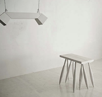
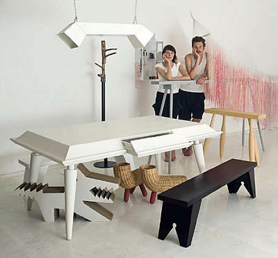
Rui Alves who operates under My Own Super Studio comes from a family of skilled craftsmen. His grandfather was a carpenter and his father was a woodworker. His mind is always working on creating or disassembling something.
His design approach reflects his love for materials, processes, and simple everyday objects. Always paying attention to details – almost obsessively – he tries to make things that are simple, practical, and playful, and at same time give them a personality.


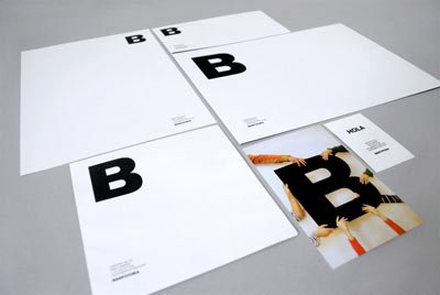
Luv the new identity of Barfutura – designed by Rocío Ballesteros and art directed by Sergio González Kuhn. I really like the using of the huge ‘B’ in the business card. Typography rules!


Beyond what? beyond tellerrand (loosely translated means Think outside the box) is a conference about creative web design and development taking place in Düsseldorf.
3-day event with intensive workshops and 15 high quality talks for web enthusiasts: design, technique, inspiration and networking.
Upcoming: November 20-22

Have a look at the terrific Hui-Hui fashion collections concepts! Stunning photography by Florian de Brün. Featuring: Rock-Paper-Scissors – winter 2011/12 original staging and photo montage.
Luv the overview shots. Such tension – drama. And that light! Just perfect! Hats off.

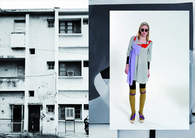
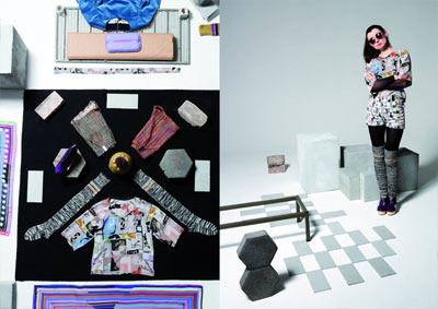
Alexi Hobbs lives and works in Montreal. But loves to travel. Is available for scotch, preferably of the smoky kind. Is also available for editorial work and any other fun project where you think his keen sense for colour and light might be put to good use.
Check out the tear sheets from a recent assignment with En Route magazine.


Commun is a new kind of advertising agency. Although text is available in French only – easy to navigate and understand what the projects are about. Check it out.

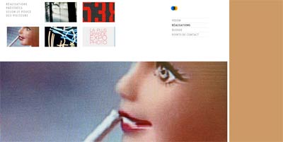
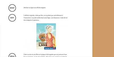
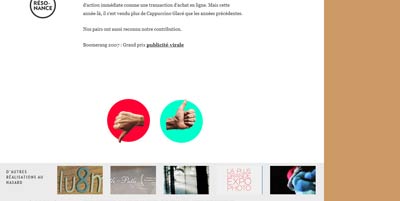
Making me smile. 6+1 is all about a meeting between six people; six personalities with vastly different backgrounds and experience, all of whom share a same vision of the world of communication. "Sparking a new empathic advertising generation"
Well the rotating backgrounds are proof enough.


Oscar & Ewan is a design studio based in East London. their work is a blend of graphic design, creative direction and idea generation for projects both large and small, from music packaging to complete brand identities.
Check out the Roots Manuva – Slime & Reason / Singles cover designs. What an idea to have cast of artist made with hollow head space to be filled with objects that infer album titling.
Original thinking and attention to detail indeed.


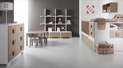
There comes a time (or will come a time) when having little ones will be part of our lives. Limba is a company specializing in furniture that is not only playful but functional to a point that I wonder why it hasn’t become the norm.
Enter a world of colours, of pink princesses and white knights on red horses, green skies and yellow clouds. Enter and discover orange dreamscapes among purple planets.
Luv the crib / diaper / storage / playroom / units.


Atelier Jellyfish, who is an art director specialized in editorial design and identity.
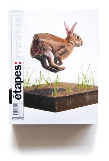
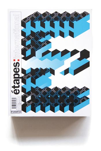
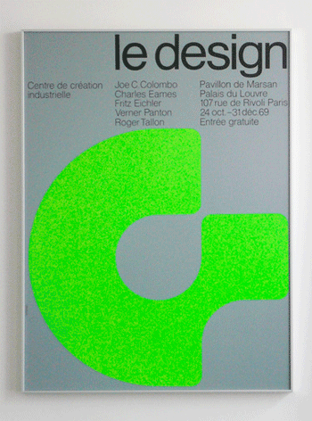
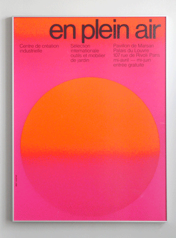
Jean Widmer, graphiste, un écologiste de l’image. Loosely translated: Jean Widmer, graphic artist, a visual ecologist. These magazine covers are exemplary as minimalist treatment.
Aren’t they awesome?
_______
via: The Brilliant Work of Jean Widmer by Antonio Carusone (overview article of his career).
Freshly found! Paul aka Notfrombrooklyn who describes as a design cultivator (luv it) is a freelance multi-cross-platforms creative (editorial – illustration – apparel). His work covers many genres and styles, and close to street culture and the many brands servicing it. He has been published and featured all over the place.
As an example, check out the Westworld rebranding – which already had a brand but it needed re energising. He created this robot character (reminds me of the Napster logo) which was to become the iconic symbol for the store.

_______
Cool hip character design illustrations.
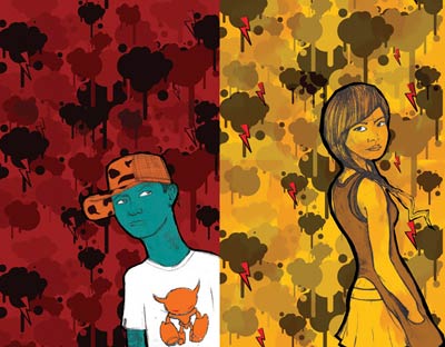
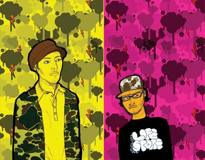
We have a ‘strategic plan.’ It’s called doing things. — Herb Kelleher
That quotes resonates w/ me as I’m enterprising to build the divingboard and initial network for the upcoming fanta project I’m working on.
It’s an template statement of exactly how I’m thinking.
_______
Valid and smart list of cues in the following post:
Just get things done, and not another strategy plan! by Andre Ivanchuk
It’s not about talking to do something
It’s not about thinking to do something
It’s not about planning on doing something
It’s not about creating hoops to jump through
It’s not about creating forms
It’s not about distributing memos
It’s not about meetings
It’s not about adding more resources
It’s not about inner-office politics
It’s not about bureaucracy
It’s not about policies
It’s not about the leadership
It’s not about nostalgia
It’s not about could’ve, should’ve, would’ve
It’s not about playing business
_______
_______
poster by: MODD – Like it? Youu can buy it here.
The Lost Type Co-Op is a Pay-What-You-Want Type foundry, the first of its kind.

Founded by Riley Cran and Tyler Galpin, originally in a whirlwind 24 hour adventure to distribute a single typeface, it has blossomed into a full fledged foundry, distributing fonts from designers all over the world, with its unique model.
_______
Nice web 2.0 goes retro interface design.


_______
via: Vian Peanu
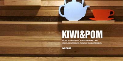
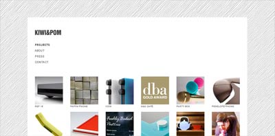
Kiwi&Pom is a London based design consultancy who have been creating human experiences since 2008. From products to furniture and interior architecture, they believe that the value of design is the human experience it provokes.
Moder meets retro-modern mixing new tech and homy.


Someone to watch for: Kaloian Toshev – a young illustrator.
_______
Showing: Dull Life

_______
Showing: Illustrations for Capital Light® Magazine

Just love the fantastic white on magenta / red BLANK studio space. Neat-o interior layout with space to spare – light and the right amount of brightly colored chairs.
Meticously decorated around the brand name (blank) – which means empty – and expressed with lots of white ’empty’ artifacts. Smart!
View BLANK portfolio (and nice website placeholder).


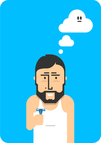
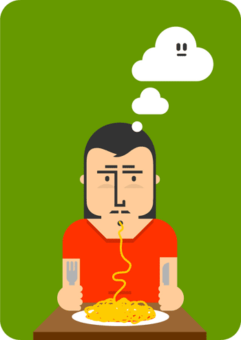
Joel Lozano is a freelance graphic designer from Barcelona. With a large experience on graphic design, illustration, motion graphics and typography. He can do simple – as in these character designs. Or incredibly complex. Read on.
_______
Download as wallpapers for desktop or iPad. He also offers an overview of the design process. Design was created using a generative (.ai) brush created by flan*. Go learn some.
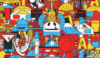
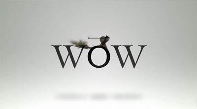
Wow tenspace animation is based on presenting numbers from 1-10 – on a beautiful music track by Artless studio.

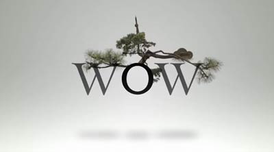
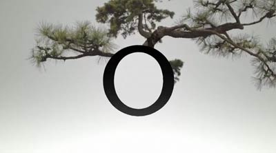
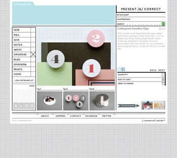
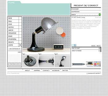
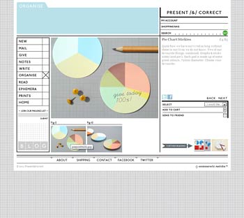
Present / & / Correct opened its virtual doors in 2008. A place for their own designs, things they love by other designers from around the world and vintage items which they discover around Europe, and sometimes further afield.
It’s a showcase for the things they have enjoyed since school. A long-term obsession with stationery has culminated in a constantly evolving store.
Perfect website / store. Outstanding selection and well-organized presentation. Luv the background – reminds me of the draft paper I use sometimes for mock-ups.

_______
Additional: Wanna see more cool objects? Check-out my SYPPLY.
Grain & Gram — The New Gentleman’s Journal is a promising new blog on the block. Interview based – their editors look into presenting professionals in their working surrounding.
Interesting questions – beautiful photography – stellar presentation.


The Art of Clean Up: Sorting and Stacking Everyday Objects by Jeannie Huang
Swiss artist Ursus Wehrli is releasing a new book on The Art of Clean Up, where he takes everyday scenes of disorder and rearranges them into neat rows, sorted by different attributes such as color, size, shape, and type, etc.


_______
via: Sam Dallyn
Daily grind of filtering /deleting spam is a pain I could do without.. After all these years – still don’t get what is the motivation of those programmers and employees that deliver day-in day-out a massive load of annoyment.
Sometimes I blacklist IPs – because of somekind of server attack.. in the comments section – it’s a deluge. I’m not a back-end person. Anyway.
I’m seriously thinking of closing the option down (and I won’t be the first to do so) since most interactions I have are on my social networks..

_______
Pixel illo: Big server by Supertotto
Expressive Web Beta was developed by Adobe in collaboration with Big Spaceship with the goal of creating both a resource and showcase that highlights some of the most creative and expressive features using HTML5 and CSS3 which bring loads of new features and functionality to the modern web.
This site is a resource and showcase of some of the newest, and most expressive features being added to the web today.
_______
Read the white paper by Mike Chambers.


MOMA Talk to Me online exhibition can lead to serious time-spending. Amazing website with tons of as amazing projects, designers, work in all walks of design disciplines.
Thus far, 21st-century culture is centered on interaction: “I communicate, therefore I am” is the defining affirmation of contemporary existence, and objects and systems that were once charged only with formal elegance and functional soundness are now also expected to have personalities.
Contemporary designers do not just provide function, form, and meaning, but also must draft the scripts that allow people and things to develop and improvise a dialogue.
_______
Snapshots are from the objects directory. Pick one and of you have a wheel-mouse use it to make more little spheres (and projects) appear.


Republic of Nothing is a design studio based in Mexico City, founded in 2010 by a pair of designers, who have as a constant goal, the conceptualization and creation of consistent, memorable, effective and tailored design projects, that service the real communication needs of our clients, without leaving aside the details, the aesthetics, that make a brand something special and different.
We don’t believe in borders or language barriers.
Design is our language.
_______
Website, work, versatility, creativity, presentation and talent are all exceptional. Another of this year top portfolio. Oh did I say? Luv their logo.


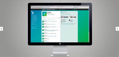
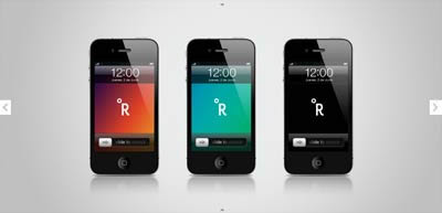
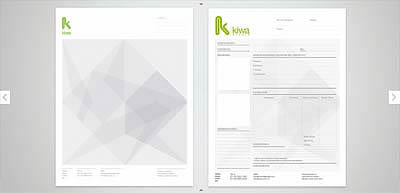
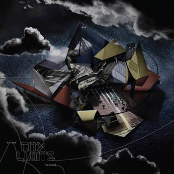
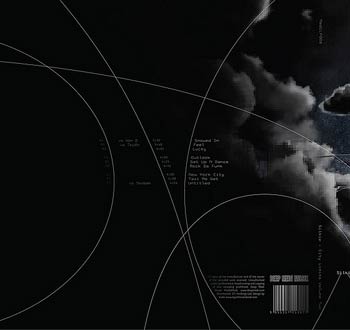
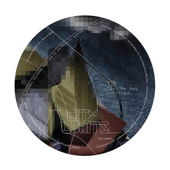
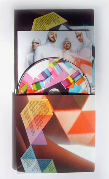
Luv the album (sleeve and cd) outstanding concepts and designs that Alex Kurina came up with.
______
_______
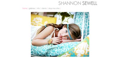
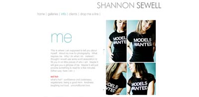
Must say I’m pretty impressed by the opening index of Shannon Sewell – who is an extra talented photographer mostly working with kids. Not only the pictures are lovely but demonstrate the level of skills and professionalism..
But back to the index, she took care of offering different devices such as desktop – iPhone – iPad versions as well as a link to her blog.
Investing in your users experience? Priceless.


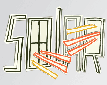
Sergio Jiménez aka Subcoolture which he started in 2007, focusing on illustration and lettering. Palabrería are recent illustrations for Dominical, a supplement of the spanish newspaper El Periódico de Catalunya.
Luv the typographic DIY approach.
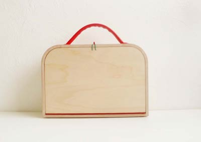
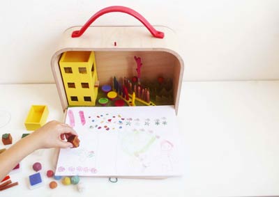
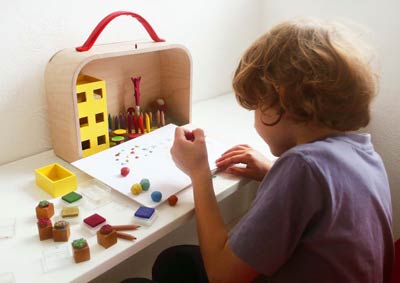
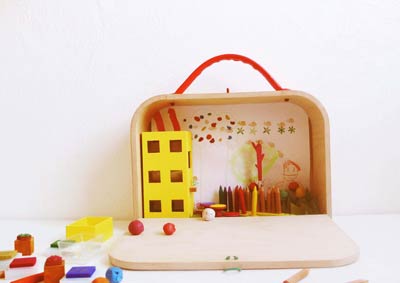
‘My Theatre’ is suitcase containing a colouring set for children imagined by Hina Thibaud. The inside of the box represents a landscape. Each item symbolize a part of the city: The child is an architect and participates to the layout of the suitcase by sticking his drawings in the background.
The project brings the child a protective feeling while travelling. They take their suitcase everywhere and transport their little world they have created, to feel more comfortable in a place they do not know.
This is such a fantastic idea and should be commercialized.
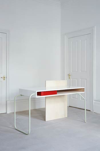
There is a strong human influence in Tomás Alonso work. He’s particularly interested in the relationship we have with objects and how these objects relate to us and other things that surround us. He enjoys experimenting with different materials and making the most of their properties.
Check out the cool minimalist Variations on a tube to see a good sample of what he does. Luv his take on what an ‘armoire’ is.

Ever tried. Ever failed. No matter. Try again. Fail again. Fail better. – S.Beckett
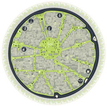
Struggling with mapping a design project. Tho I read and do research – tried and failed so far. Beckett’s quote and c31913 maps are right-on for me.
Need a design-like GPS to locate these loose ends.
_______
via: Comosgraphies by c31913
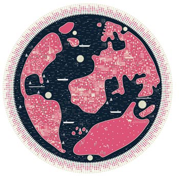
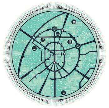
Our encounter with urban space is mainly volumetric and sensorial, but never planimetric. Instead, we live surrounded by maps, GPS and other geo-location systems.
The 10 Commandments of Steve by Leander Kahney. More than anything else, Jobs’s genius is in managing the creative process. Here’s his playbook.

_______
Some of these are keepers:
1. Go for perfect
2. Tap the experts
3. Be ruthless (not sure about that)
4. Shun focus groups
5. Never stop studying
6. Simplify
7. Keep your secrets
8. Keep teams small
9. Use more carrot than stick
10. Prototype to the extreme
_______
Errata #2 – I.M. Pei is an architect and he did not design the Next logo. Geeze. It was none other than Paul Rand.
via: Stella Gassaway
_______
via: The Daily Beast
Logo design for ABO, an annual funding platform made for local startups in Puebla, Mexico by Burocrata.


BIC Never Ending Friends project was interactive art directed, designed and illustrated by Leandro Lima. Luv the recognizable hand-drawn looking pen-like blue marine blue with red accents.
Brilliant concept.
_______
You can view the live website here.

Still running Out of order website which used a grid of numbers to display their work as animated .gif. Don’t get why there are empty box tho. Circa 2005.


Search for inspiration and/or talent in Netdiver Mag.
pinterest / medium / linkedin / X / rss

Our little studio owned Adobe Master Suites—invoking security issues our perpetual licenses were nulled. Undone? No!
I can open all .pdf, .psd or .ai files in the Affinity apps and the UI/UX is so gorgeous!
See for yourself: test the Affinity suite. Works on all platforms + iPad for—6 MONTHS FREE!
_______

Connected to the internet's origins, building the internet of the future. We’re building ways to help everyone fight for privacy online. I am a big fan of their services.
_______

What a strange name for an independent Internet privacy company. Contrary to G/ who records every instance of their services useage with DDG, no recording of your data, EVER!!!
We use it everyday.
_______

This private (free) app I use daily for taking notes or writing. Back up to the cloud for multi-devices access. Runs locally.
_______

I paint abstract with pretty colours ~ I play with mobile apps to create unique generative art.
Look 'Ma no AI.
_______

Communication Arts 24-25—calls for entries.
Interactive — October 25/24
Illustration — Jan 10/25
Photography — March 7/25
Design — May 2/25
_______

The Smashing Conferences explore real-life projects, workflows and hands-on insights.
SmashingConf - Antwerp
Upcoming: Oct 28-31/24
SmashingConf - Workshops
Online: check dates.
_______

AIGA’s competitions celebrate exemplary design and demonstrate the power of effective design.
50 Books | 50 Covers: February 26 / 24
365: AIGA Year in Design February 26 / 24

It is a conference and a community of thousands of women influencers and entrepreneurs in creative fields.
Upcoming: March 17-20 / 24
_______

YouWorkForThem — Good design needs good fonts! YWFT is privately owned and run by designers.
Rocking it since 2001.
Mind-blowing visual feats and original designs I recently discovered.
Previously: #12 - #11 - #10 - #9 - #8 - #7 - #6 - #5 - #4 - #3 - #2 - #1

_______
Illustration is probably the largest creative area to express (mostly without words) a message.

_______
A type of Show #5 – I love typography - these projects caught my eye.

_______
Moodboards #1 – Branding collaterals staged and served with conceptual brilliance.

A little (www) Story. In 1995, JF and I started a little project — Netdiver mag.

_______

Editorials. Design topics or issues that have impacted me and/or our creative industry. .
Over 50 articles.
_______

A short interview on how to build a strong portfolio + self-promotion.
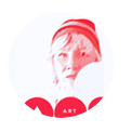
Carole Guevin is a founder + editor + design curator ∞ culture creator + online pioneer ∞ featuring the creative culture since '98.
_______
No hype — just beautiful
_______

Netdiver long-standing mini visuals (200 x 115 px) galleries. Each lead to its review. Happy talent discovery!
_______

Vast array of drawing styles
404 reviews
_______

Conceptual designs standing out
358 reviews
_______

Products / packaging design / spaces +
333 reviews
_______

Brilliant storyboards / motion / vfx
286 reviews
_______

Some of the sharpest eyes shooting today
210 reviews
_______

New wave of design / interactive / mobile stars
552 reviews
_______

Women who rock the design scene with _more_ than pink design
391 reviews

Visual Brain Gravity is a producer and developer of concepts, products and brand experiences.
Driven by vision.
_______

Self-curation experiment coupled with minimalist interviews with people in the design industry I admire.
By invitation only
_______

Terrific product or service or event and wanna reach a fabulous international audience?
Advertise with us
Coming soon
_______

Netdiver Best of the Year is a yearly compilation of projects / talents who made a lasting impression the previous year.
_______

What was new in design worldwide—sort of a very unofficial record of web history as captured from {1998 - 2007}.
Over 2.3k+ projects.
_______
Walk down memory lane: hand-coded news in design from 1998-2008.
_______
Terrific product or service or event and wanna reach a fabulous international audience?
Advertise with us
Dates soon.
_______
Check what inspires me? Follow my Pinterest.


